 CONNECT
MY BLOG
ME
CONNECT
MY BLOG
ME
When it comes to web design, grids are the unsung heroes of structure and balance. They’re the invisible scaffolding that keeps your content neatly aligned, ensuring your layout looks polished and professional. And if you’re using W3.CSS, grids aren’t just easy—they’re practically effortless. Say goodbye to over-complicated grid systems that need an instruction manual; W3.CSS makes grids intuitive and ready to use right out of the box.
So, what’s so special about W3.CSS grids? For starters, they’re built with simplicity in mind. Whether you’re designing a clean single-column layout or a dynamic multi-column masterpiece, W3.CSS provides you with a straightforward system that works seamlessly across devices. No extra configuration, no complex calculations—just clean, responsive grids that adapt beautifully to any screen size.
What’s more, W3.CSS grids come pre-loaded with classes that take the guesswork out of creating layouts. Want to split your content into thirds? No problem. Need equal-width columns? Easy. With W3.CSS, you’re in control without having to wrestle with endless lines of code.
Ready to dive into the details? Let’s explore how to put this grid magic to work!
The W3.CSS grid system is a fantastic way to create responsive layouts with minimal effort. At its core is a 12-column fluid grid that adapts beautifully to different screen sizes. Whether your users are on a phone, tablet, or desktop, your layout will look polished and professional without you needing to tweak anything manually. Let’s break it down with an example.
In W3.CSS, you create a grid layout using the `w3-row` class for rows and the `w3-col` class for columns. By default, columns span equal widths, but you can easily customise this by defining how many columns each block should take up based on the screen size. The framework uses a mobile-first approach, so your designs are always optimised for smaller devices before scaling up.
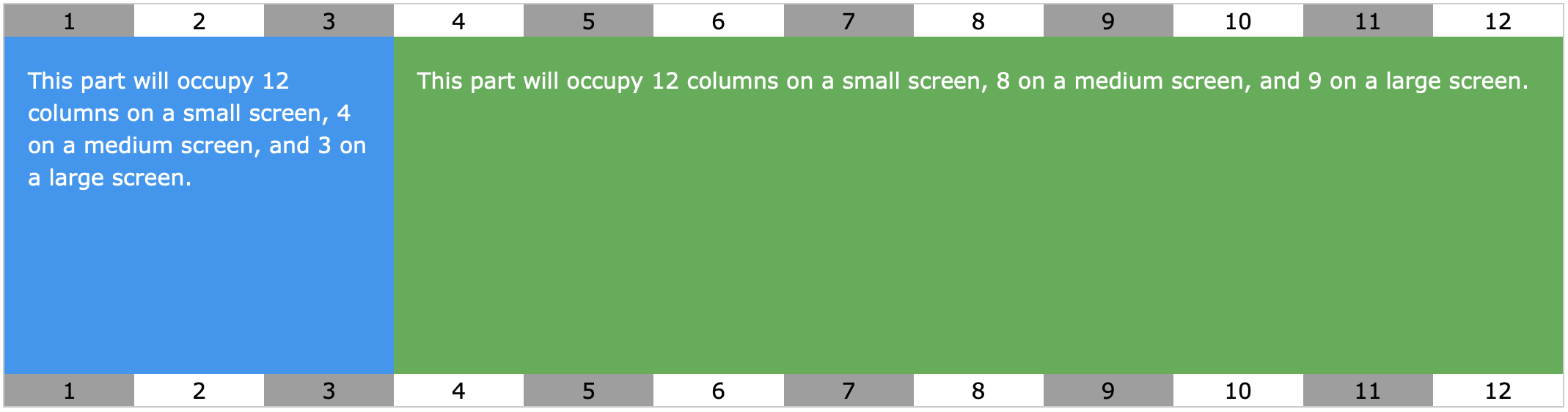
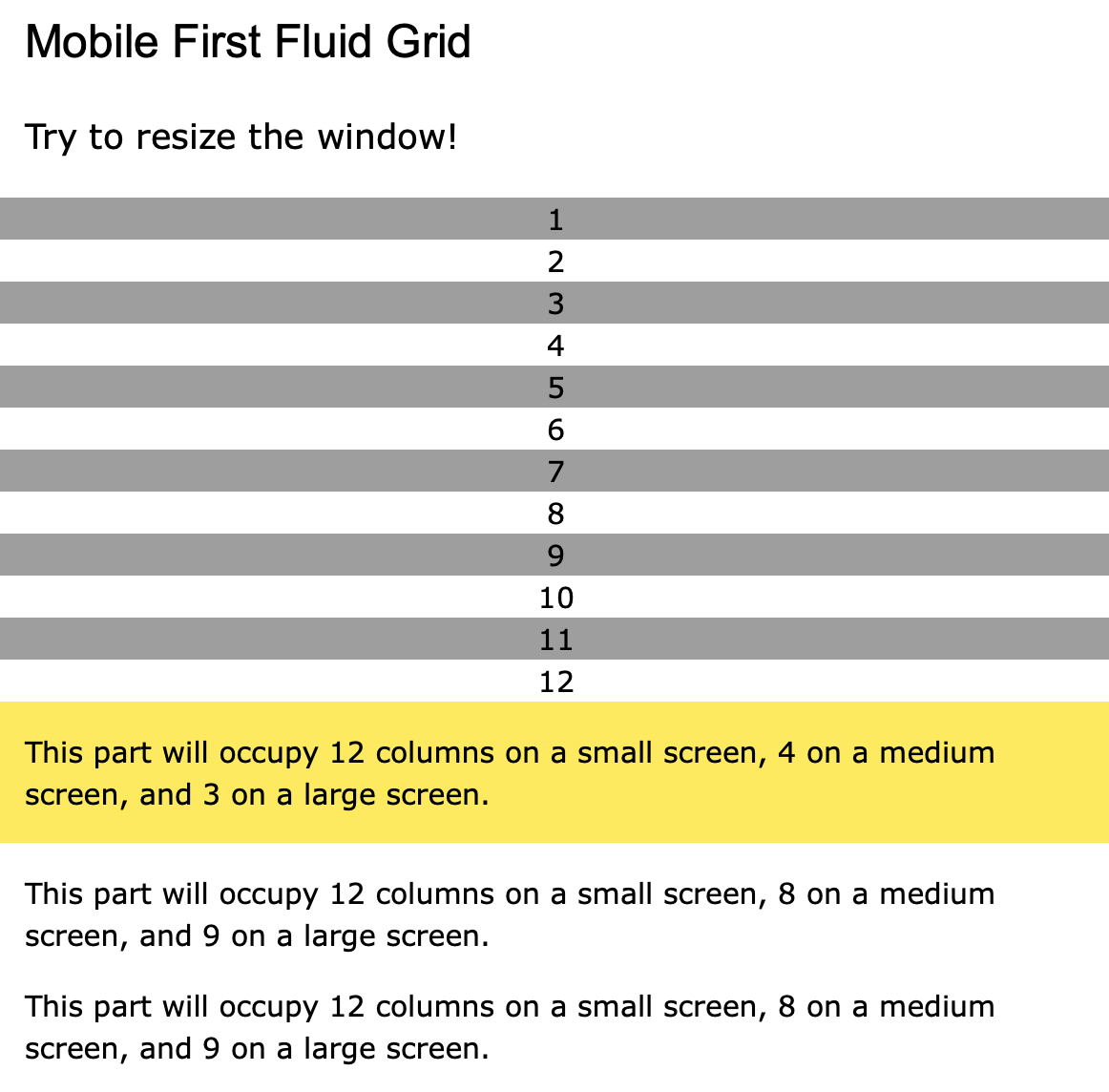
Here’s a simple example to illustrate how the W3.CSS grid works. It includes a fully fluid 12-column setup where content shifts dynamically depending on the screen size. Resize the browser window to see the magic happen!
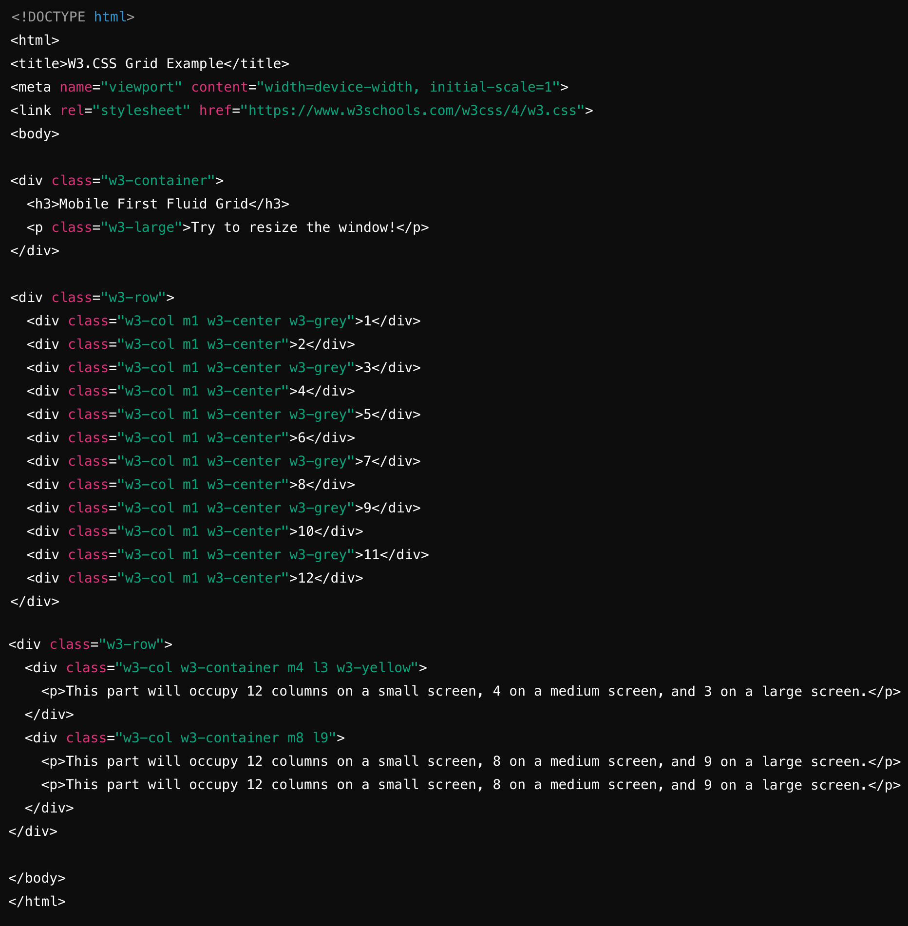
Here’s what’s happening:
• Each 'w3-col' represents a column, and the 'm' and 'l' classes control how many columns it spans on medium (tablet) and large (desktop) screens, respectively.
• On small screens, the default behaviour is for each column to take up the full width (12 columns).
• The second row showcases how you can mix and match different column sizes for more dynamic layouts.
Using W3.CSS’s grid system, you can quickly create complex, responsive layouts with clean, intuitive code. It’s fluid, it’s flexible, and it’s downright fun to use—just resize your browser and watch your layout come to life!