 CONNECT
MY BLOG
ME
Here’s a simple yet effective technique using an easy method to produce a neat-looking logo. Whether you’re new to Adobe Illustrator or a seasoned designer, this approach focuses on using the pen tool to craft clean, geometric shapes—specifically triangles—and arranging them creatively within a letterform. For this example, I used the letter 'W', but you can adapt this to suit your preferred letter or style.

The beauty of this method lies in its simplicity. By combining basic shapes like triangles, you can create a logo that’s modern, versatile, and full of personality. Triangles are not just visually appealing—they’re also a designer’s secret weapon for implying movement, strength, or direction, making them ideal for a standout logo design.
The process is straightforward: we’ll start with a letter as the base, use the pen tool to draw some sharp, precise triangles, and then play with alignment, spacing, and colours to bring the design to life. By the end, you’ll have a polished design that looks professional, whether it’s for a brand, a personal project, or just a fun design experiment. Let’s get started!
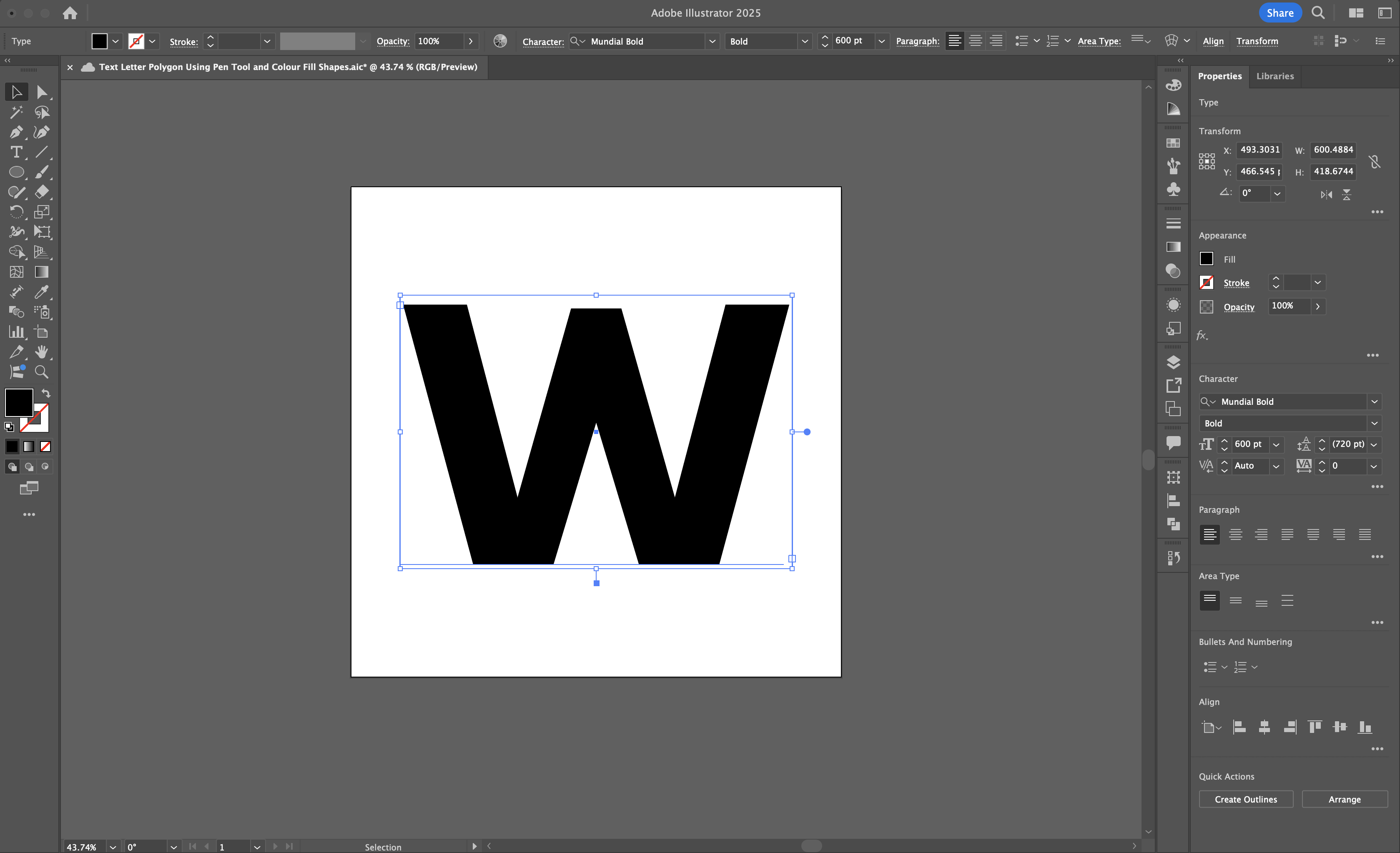
The foundation of this logo design is a bold, strong letter. Open Adobe Illustrator and use the Type Tool (T) to type any letter you like—let’s stick with 'W' for this example. Choose a font with a nice, bold look to ensure the letter provides plenty of clear space to work within. Fonts like Arial Black or Impact work great for this, but feel free to explore others, I used one called Mundial in Bold. Once selected, set the Fill colour to black and remove the Stroke colour to keep things clean.
Next, resize the letter so it fills a good portion of your artboard (around 600pt) and place it right in the centre. You can do this quickly by selecting the letter and using the Align tools in the top menu or the toolbar on the right. Now, you’ve got your canvas ready to start designing!
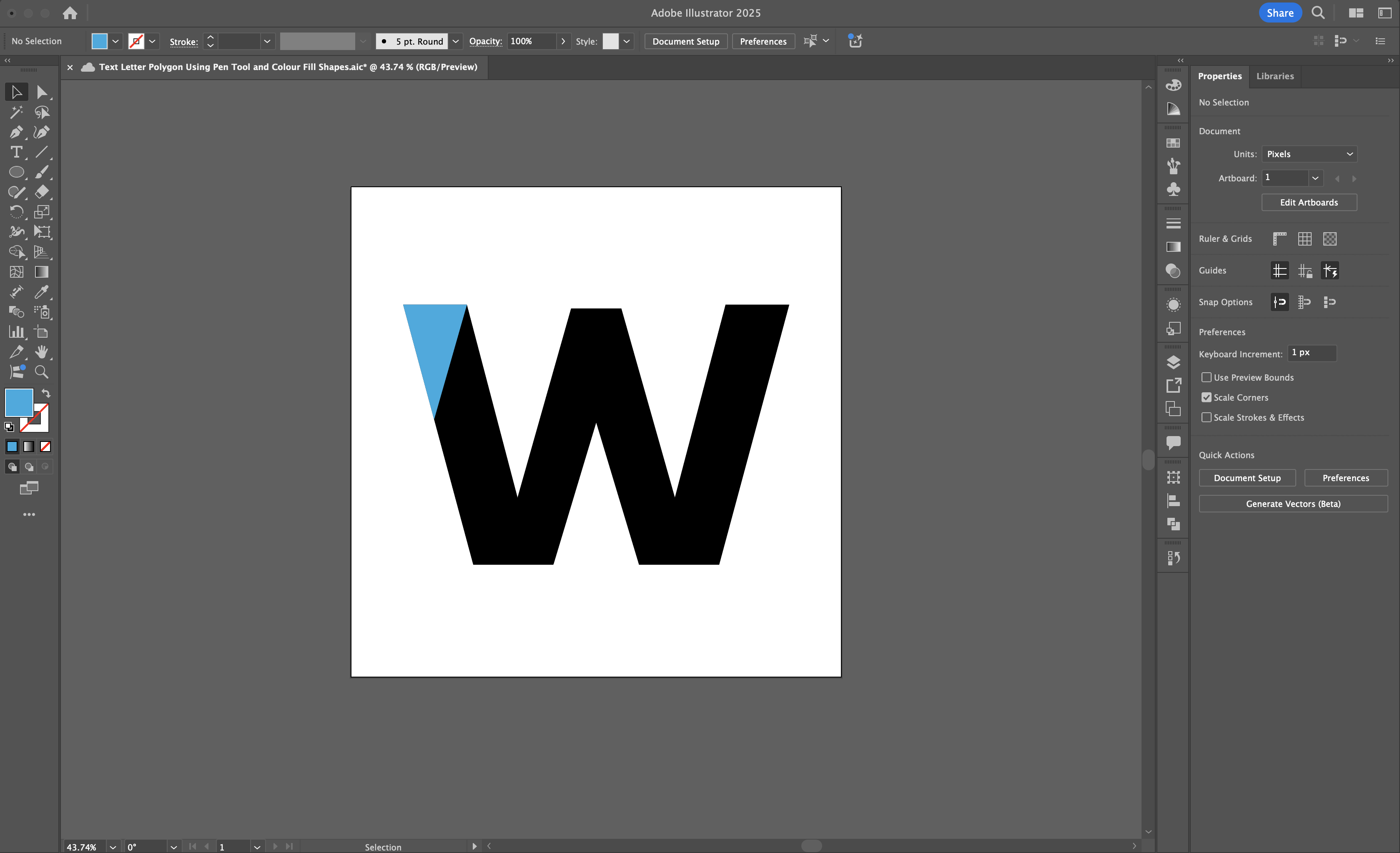
Switch to the Pen Tool (P). Inside the boundaries of the letter, click to place three points, forming a triangle. Make sure to click the first point again to close the shape—this completes the triangle. If the triangle doesn’t look perfect, don’t worry; you can tweak it in a moment. For now, keep it simple and work inside the letter.
Once the shape is complete, select it using the Selection Tool (V) and fill it with a colour from the Colour Palette. You can stick with one particular shade (I used blues), or you can of course make it multicoloured, the choice is yours. Avoid adding a stroke here, we want the design to remain clean and minimalist.
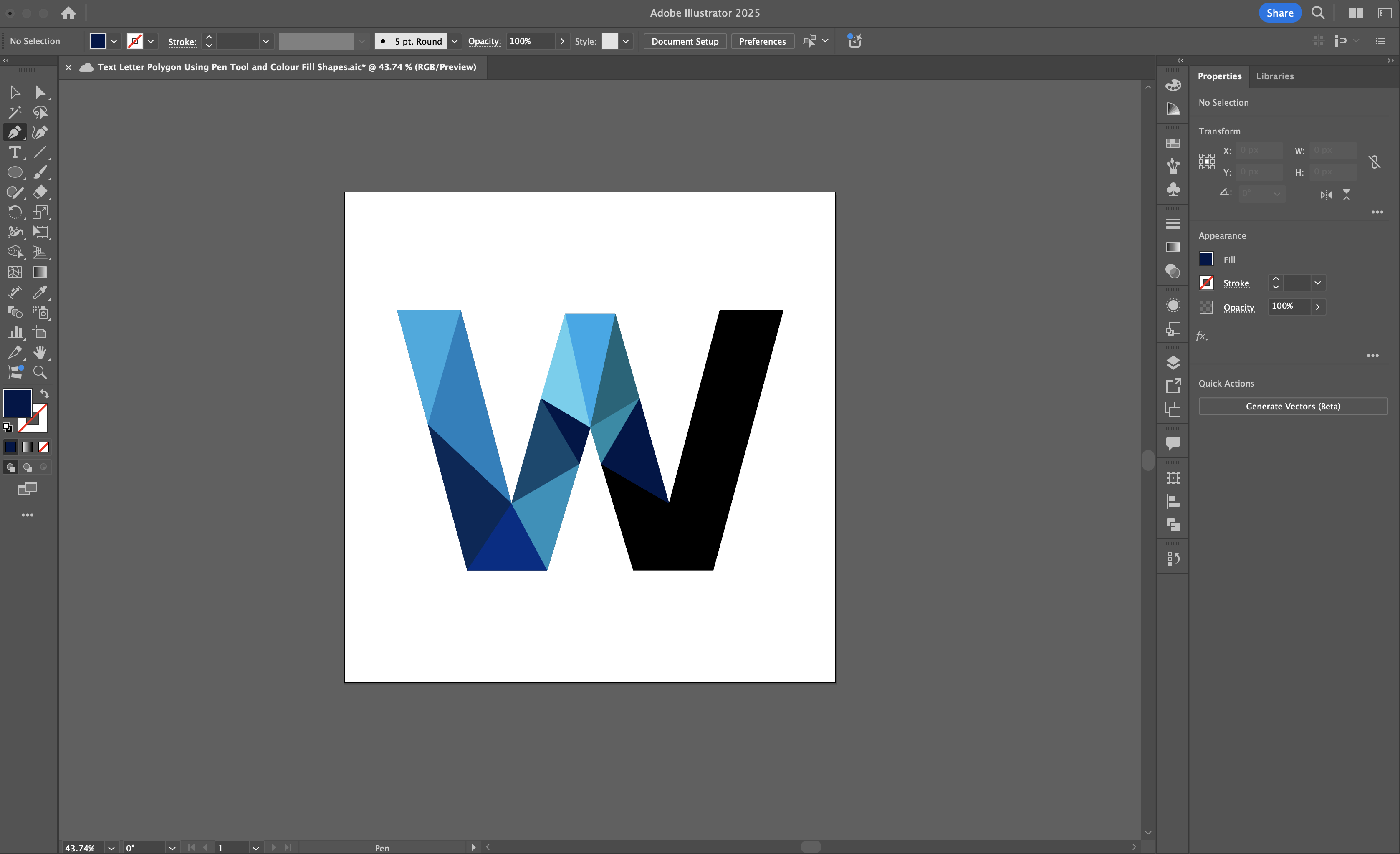
Now, repeat the process. Use the Pen Tool to draw more triangle shapes within the letter, each of varying sizes and orientations. Experiment with placement but ensure they sit snugly against each other. The goal is to create a dynamic, tessellated look.
Each time you draw a triangle, fill it with a new shade of your chosen colour palette. For this example, I used differing shades of blue to create depth and visual interest. You could if you want pick a monochromatic scheme or mix in analogous colours for a bolder effect. The key is consistency—keep your palette cohesive for a better look.
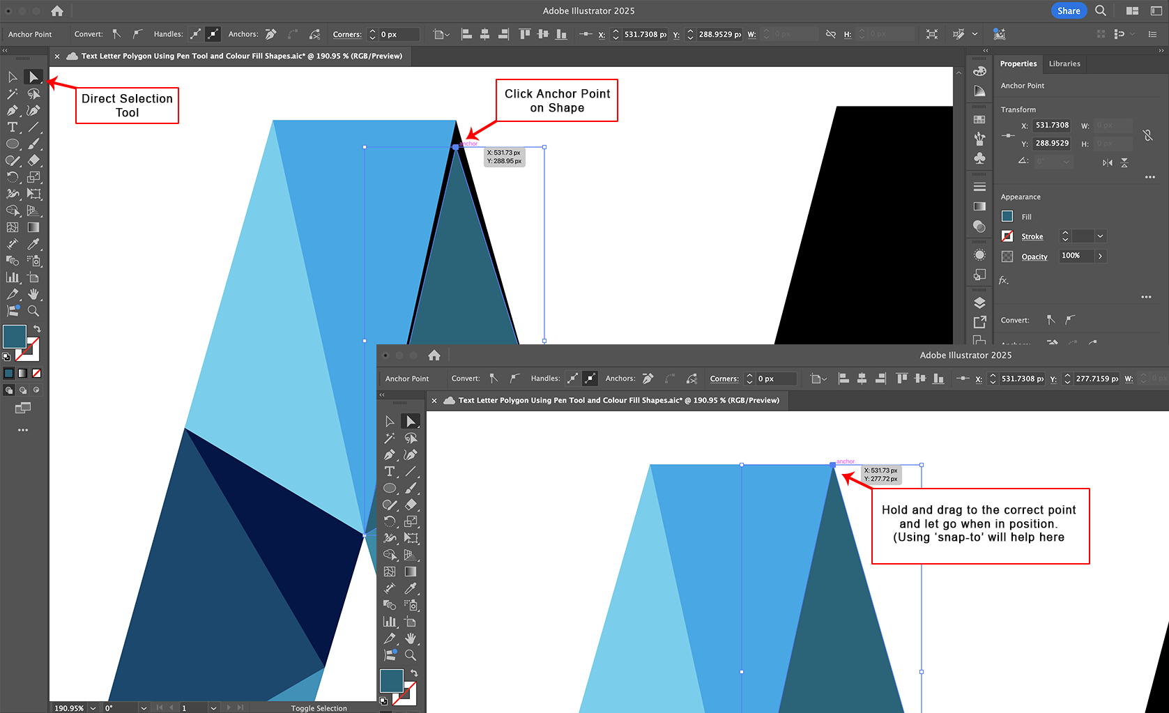
If a triangle isn’t perfectly aligned, use the Direct Selection Tool (A) to adjust its anchor points. Select the tool, click on an anchor point, and drag it to align precisely with the edges of the letter. This step ensures a sharp, professional finish. Use zoom (Ctrl/Cmd + '+') if needed to get those edges just right.
Continue refining your triangles, making sure they fit well within the letter’s form. This is where the magic starts to happen as the design takes shape! In my example, notice how I've actually made symmetrical triangles across the letter, which you could do by copying a previously created triangle shape and pasting it on the other side. You could keep the colour the same as well, which saves time with the design, but for what I thought was a better overall look I changed the colours so although the shapes were placed symmetrically within the letter on both sides, the colours were different. You don't have to keep the shapes symmetrical, you can make the triangles all different shapes as this look also works well.
Here's the final design, with a few colour variants. Enjoy!


